Complete Re Brand
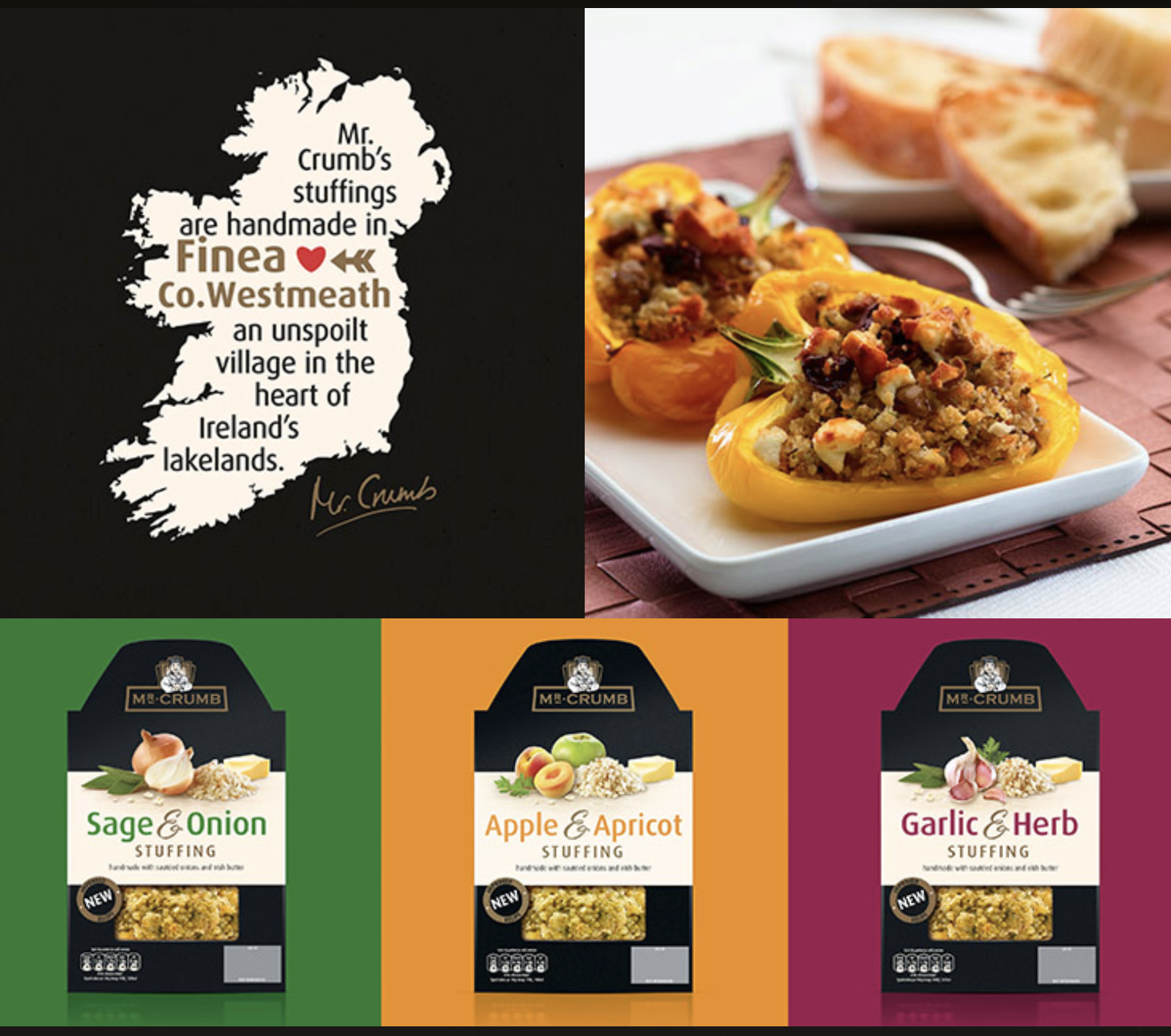
Mr. Crumb’s primary brand colour was a bright red, they wanted to position themselves as a more premium brand and initially wanted to keep the red as their primary brand colour. After struggling to achieve the desired premium look using the it I entered a “wild card” version of the packaging using black. As black is traditionally used on premium feeling packaging and no other stuffing brand was using it it made sense to give it a whirl.
Mr Crumb went for it, it gave it that point of difference in the market and great stand out on shelf as well as achieving the premium feel they were after.