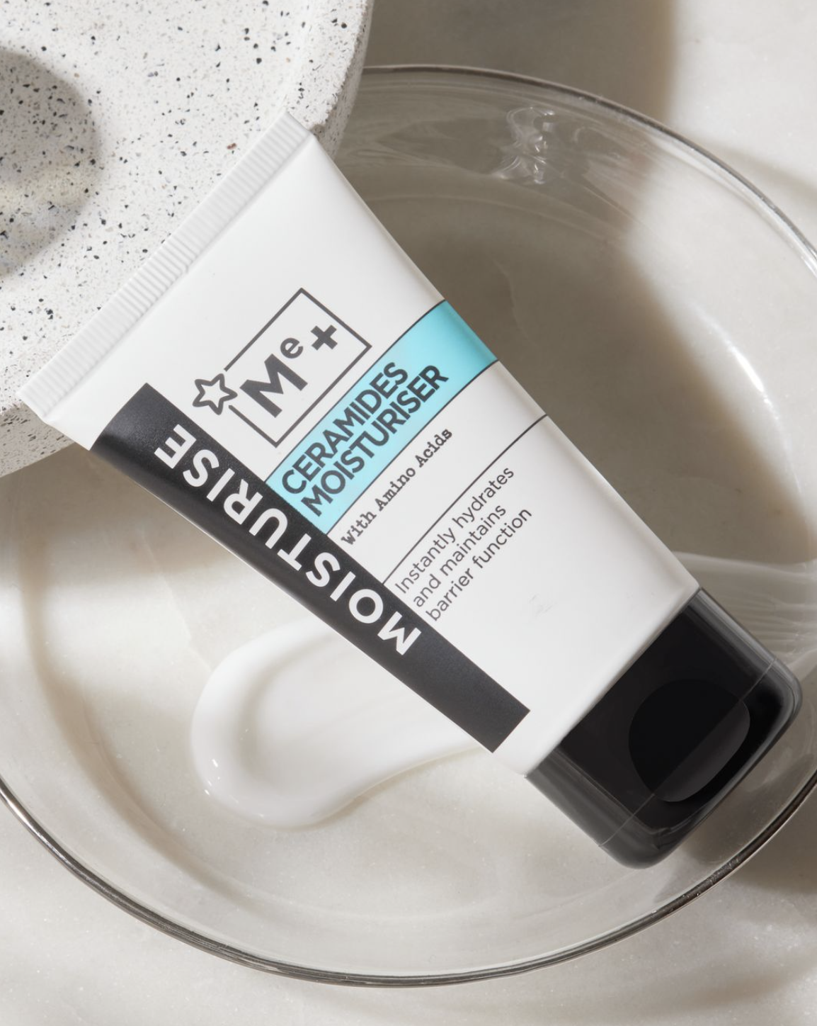
As the ingredients being used in the range were all fairly scientific I wanted to play on this aspect. Taking inspiration from the periodic table I created a logo to look like a chemical element. Calling the range “ME+“ comes from the personalisation part of the brief - It’s you + the ingredient. As the consumer is well informed already I kept the copy informative and to the point. The over all benefit running down the side and a pop of colour for each area allows for clear navigation.