Vitamins & Supplements
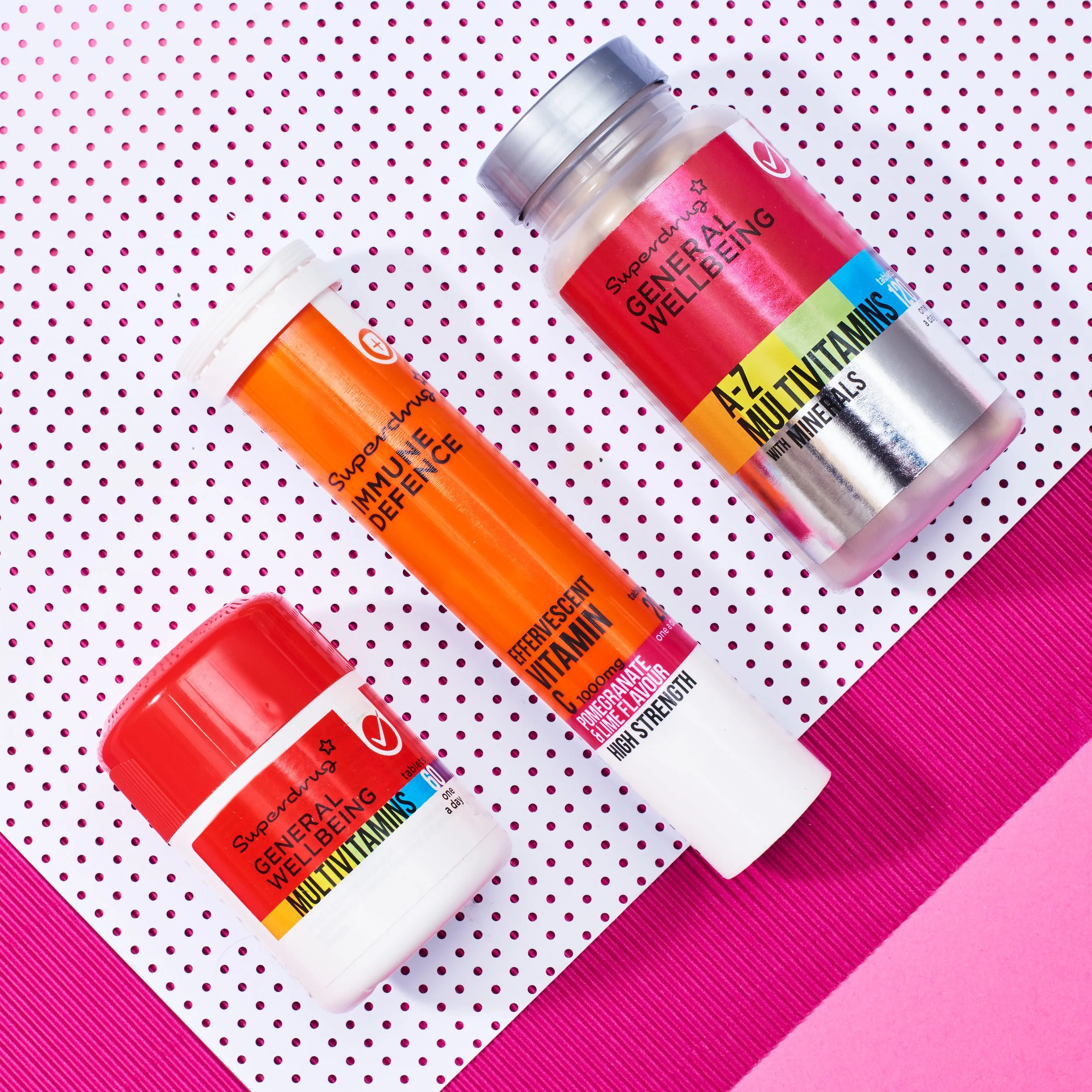
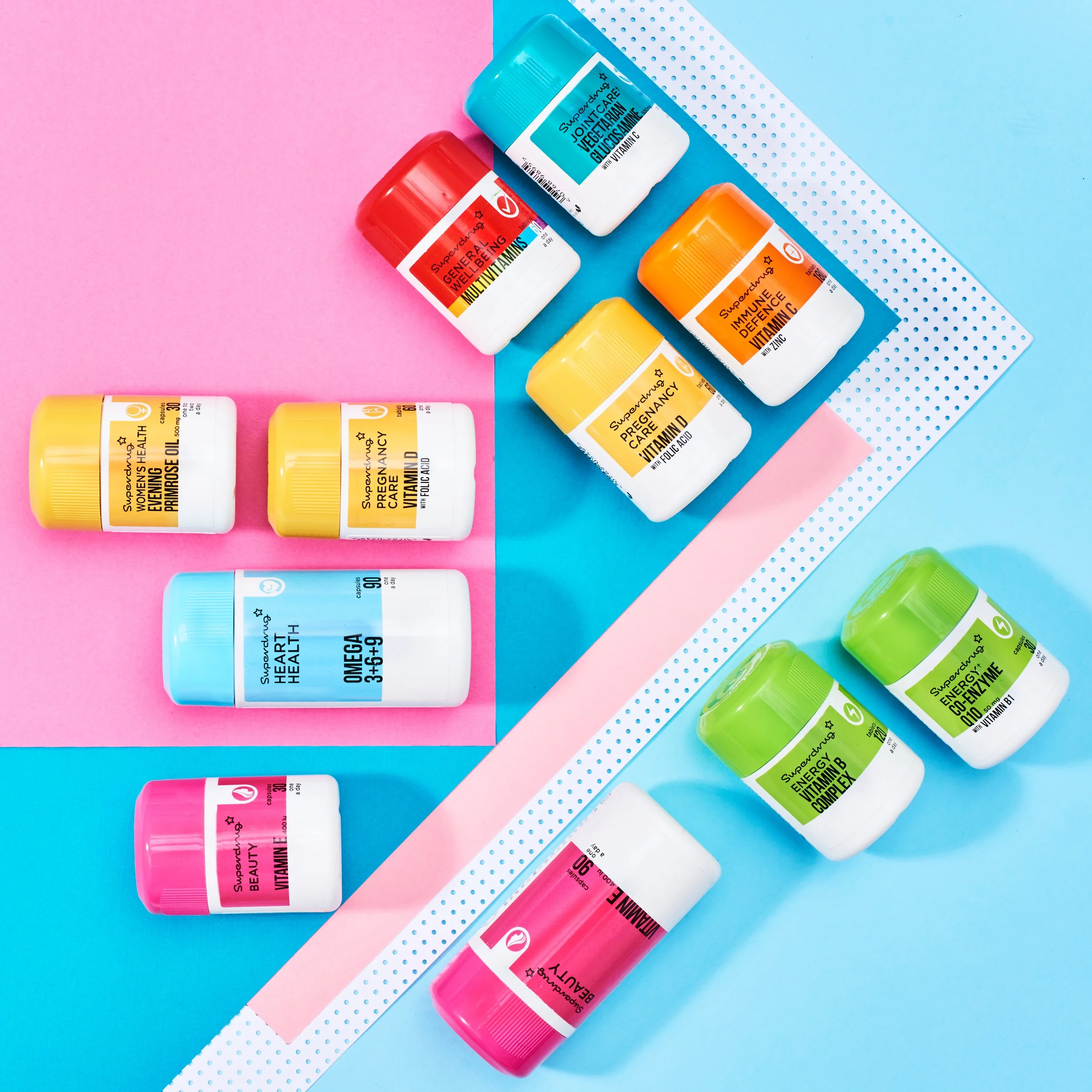
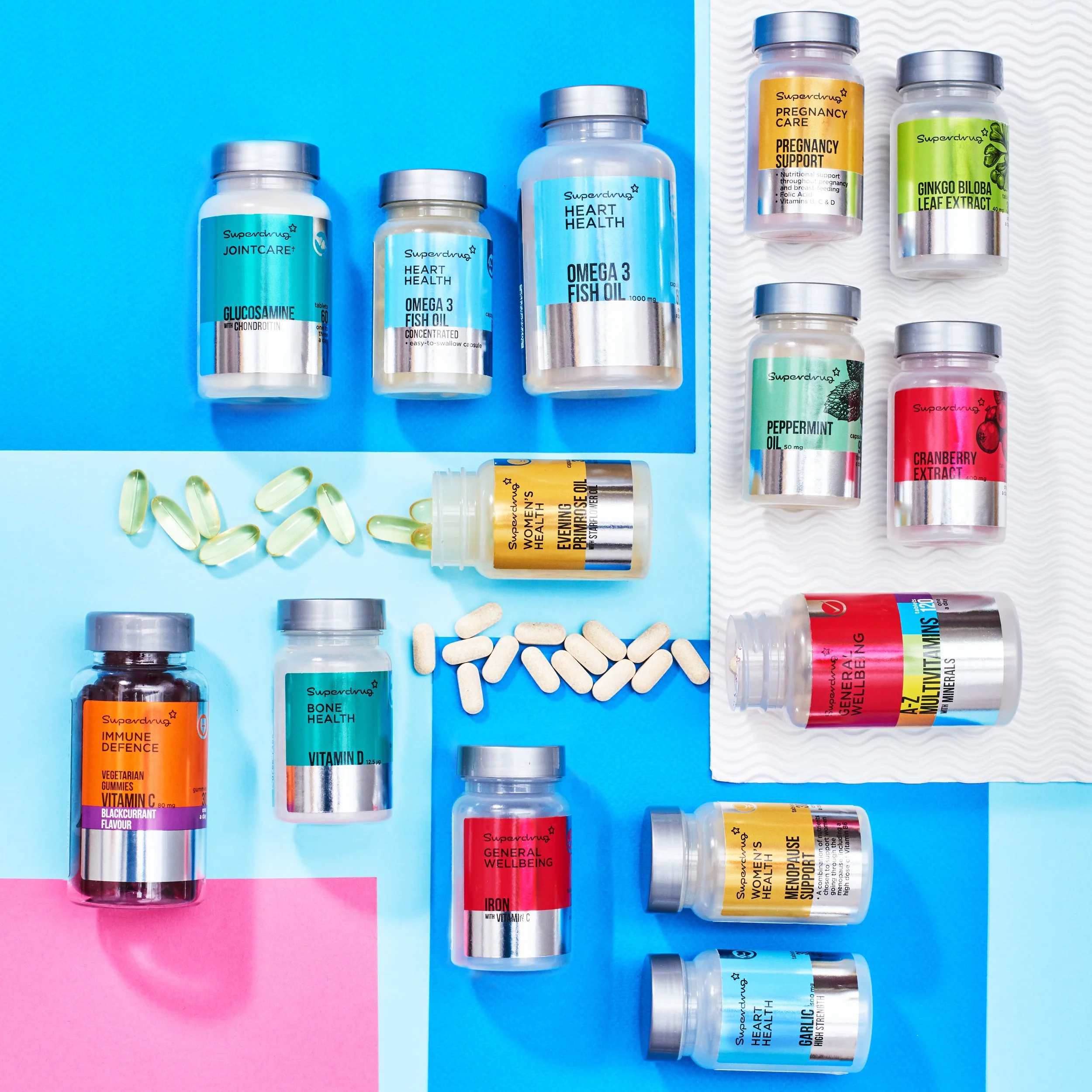
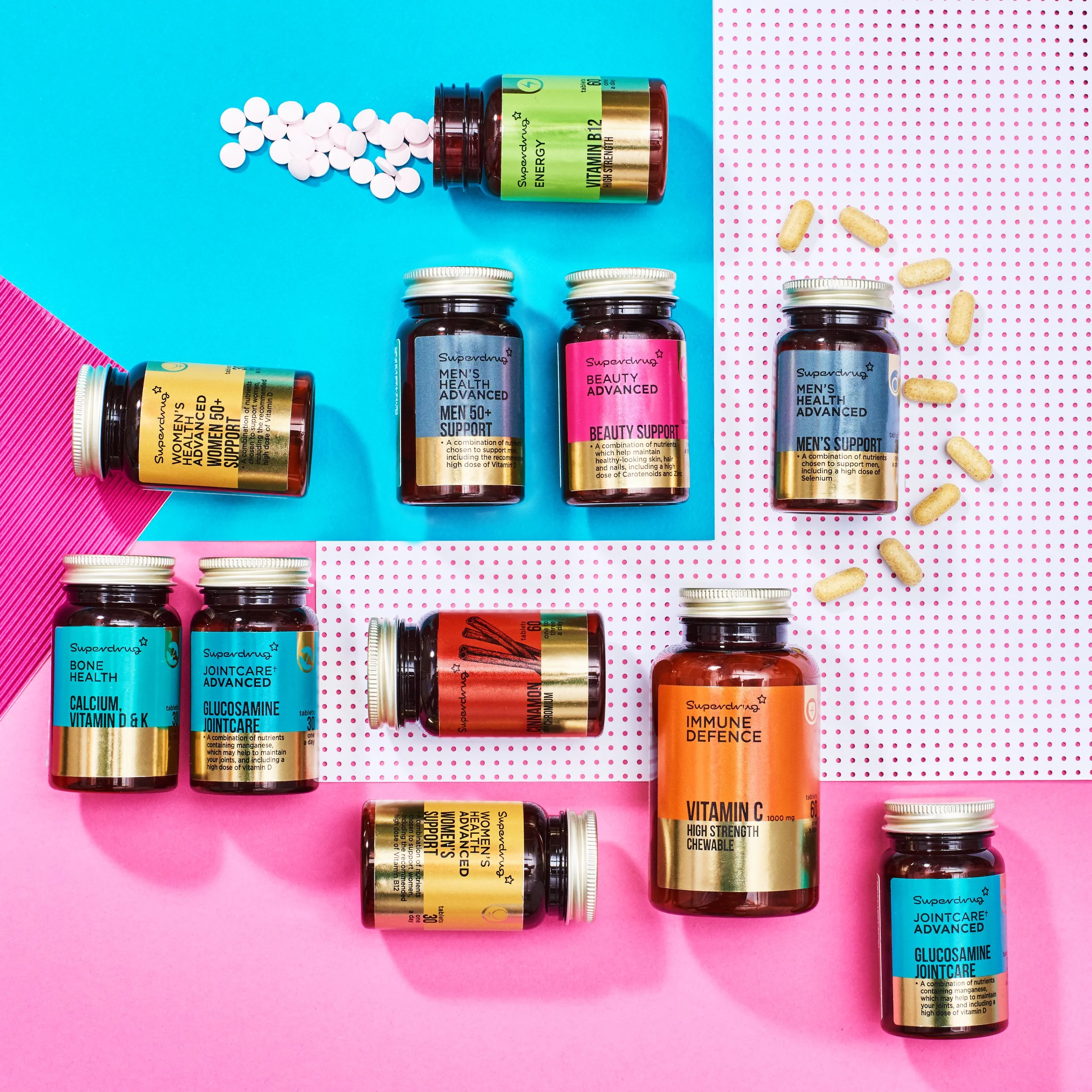
This project was all about communication and how the consumer shopped so keeping the design simple was key. I used colour blocking to easily identify the different areas within the fixture along with simple fonts to ensure readability. For the tiering a foil was added, a classic use of silver (better) and gold (best) was used. For botanicals, bespoke pen and ink illustrations were introduced to emphasise the plant based nature of this offering.
I designed icons or “category tabs” to go with each product, appearing on the side of every bottle they include a silhouette illustration that symbolises the need state. These icons can then also be used in store and online when referring to these need states. I Worked closely with the factory to ensure colour matched lids and labels to produce as strong a colour blocking as possible.